Review Experience Optimization
Redesigning WooltariUSA’s review system to be trustworthy, making it easier for verified customers to share feedback, and access valuable purchase insights.
Contribution
research ✺ concept design ✺ validation ✺ delivery ✺ quality assurance
Team
1 product designer (me) ✺ 1 project manager ✺ 2 FE engineers ✺ 1 BE engineer
Duration
4 months (April - July 2021)
Impact
User Engagement
↑ 13.7%
Credibility
87%
User Satisfaction
avg. 91.1%
Final Design
Review Section
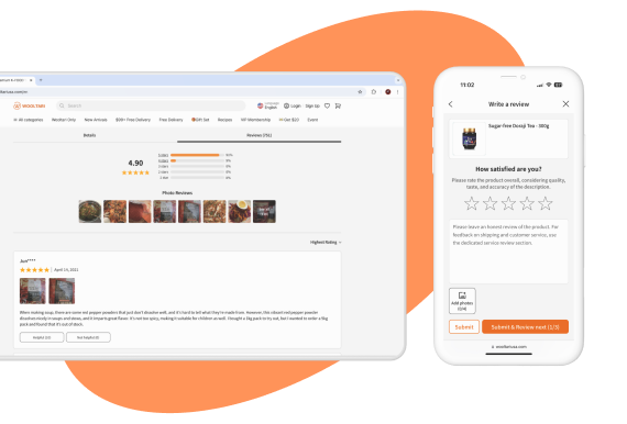
The final design for the review section ✧ eliminated redundancy and ✧ presented summarized insights in a user-friendly format.
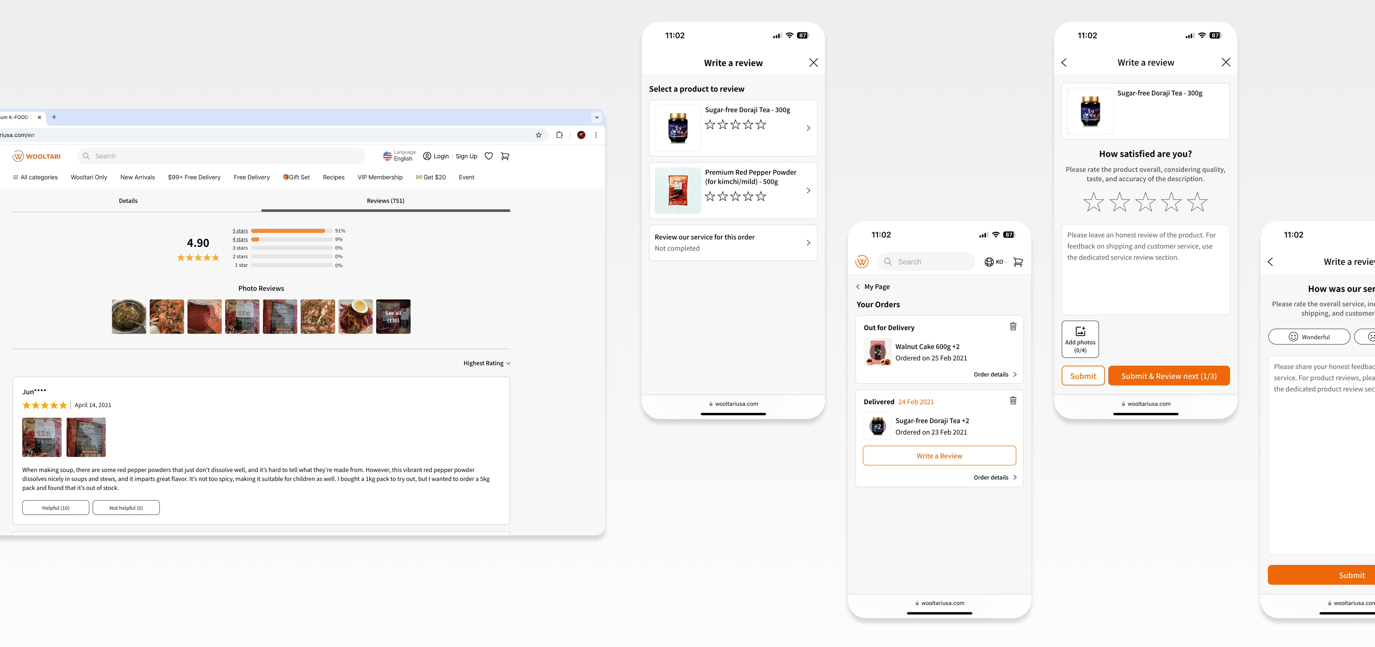
Before & After of the Review Section
Not only that, it pushed the user-centered approach further by ✧ enabling review sorting for easier navigation and ✧ adding a dedicated photo review section for users who prefer a photo-first experience.

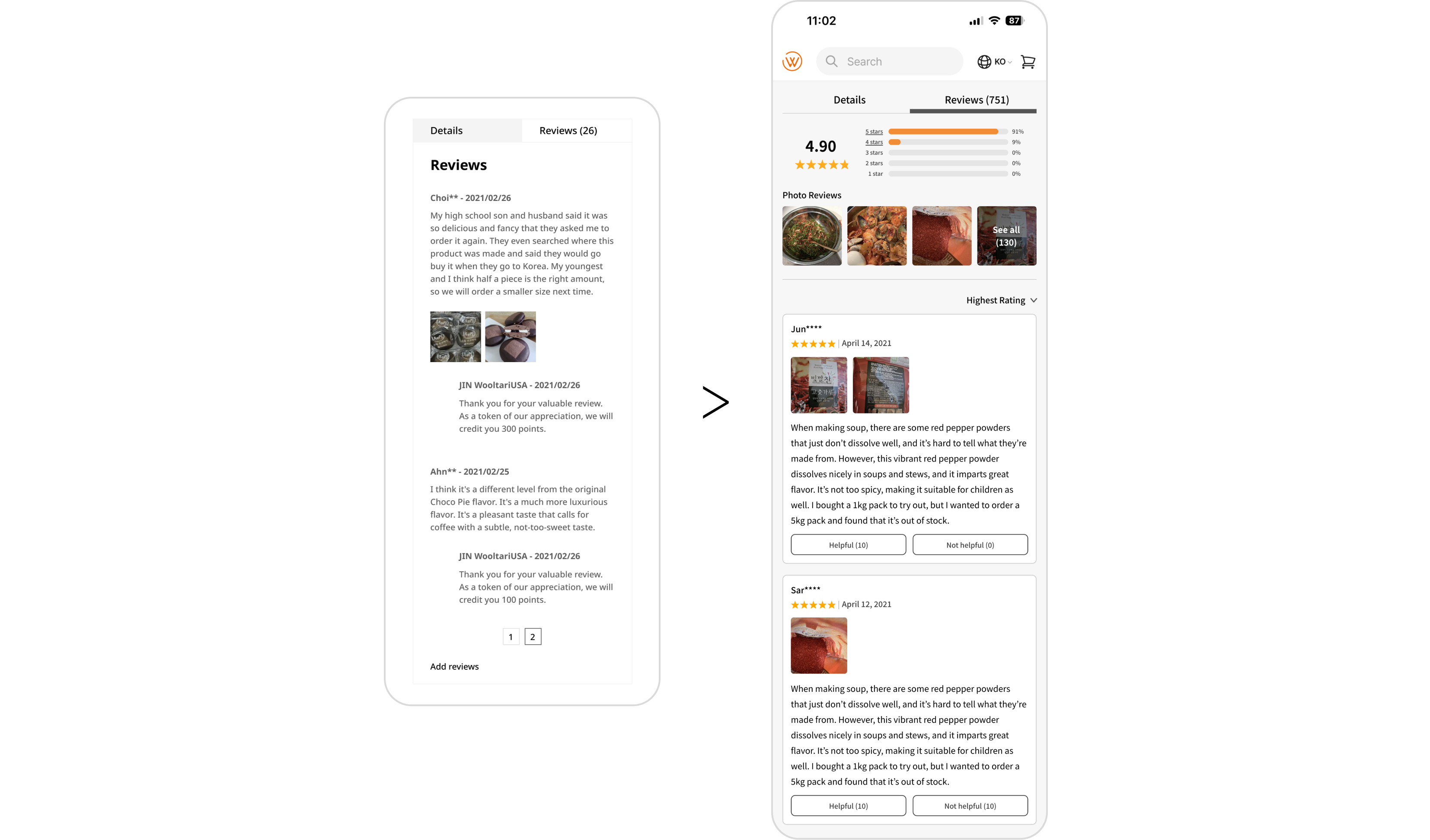
Simple Review Sorting

Photo Review Section
Review Submission
The final design ✧ restricted reviews to verified buyers, ✧ enhanced usability, ✧ separated product and service feedback to help users focus on each, and ✧ included a clear appreciation prompt.
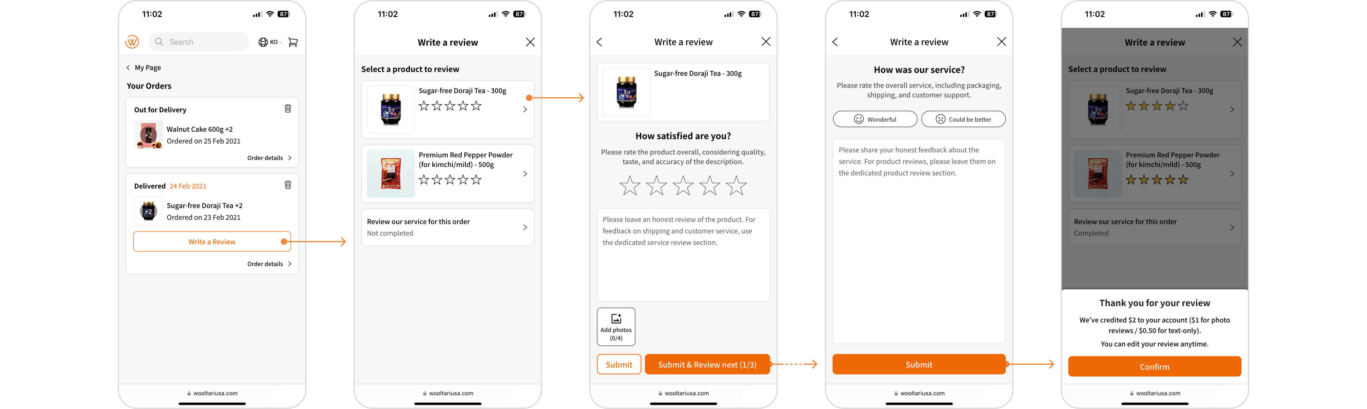
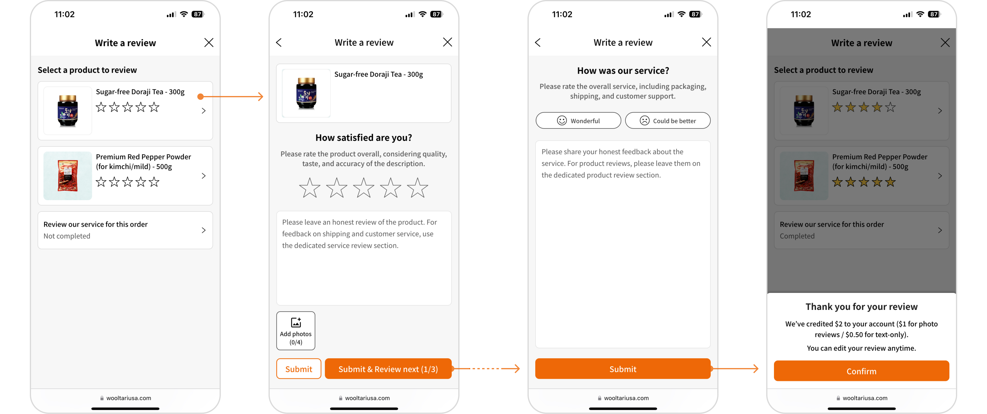
Complete flow of review submission experience
Background
In e-commerce, trust is crucial - and reviews are the backbone of that trust. As a growing platform, WooltariUSA needed a reliable, user-friendly review system to build credibility and encourage valuable customer feedback.
The existing system, however, functioned more like a comment section. Anyone, including non-customers, could leave reviews, and the process for genuine customers was cumbersome. This led to fewer reviews and skepticism about their credibility. A heat map data and a user survey, with over 540 participants, confirmed this: while 92% considered reviews their top information for purchase, they found it difficult both to leave a review and to trust the reviews.
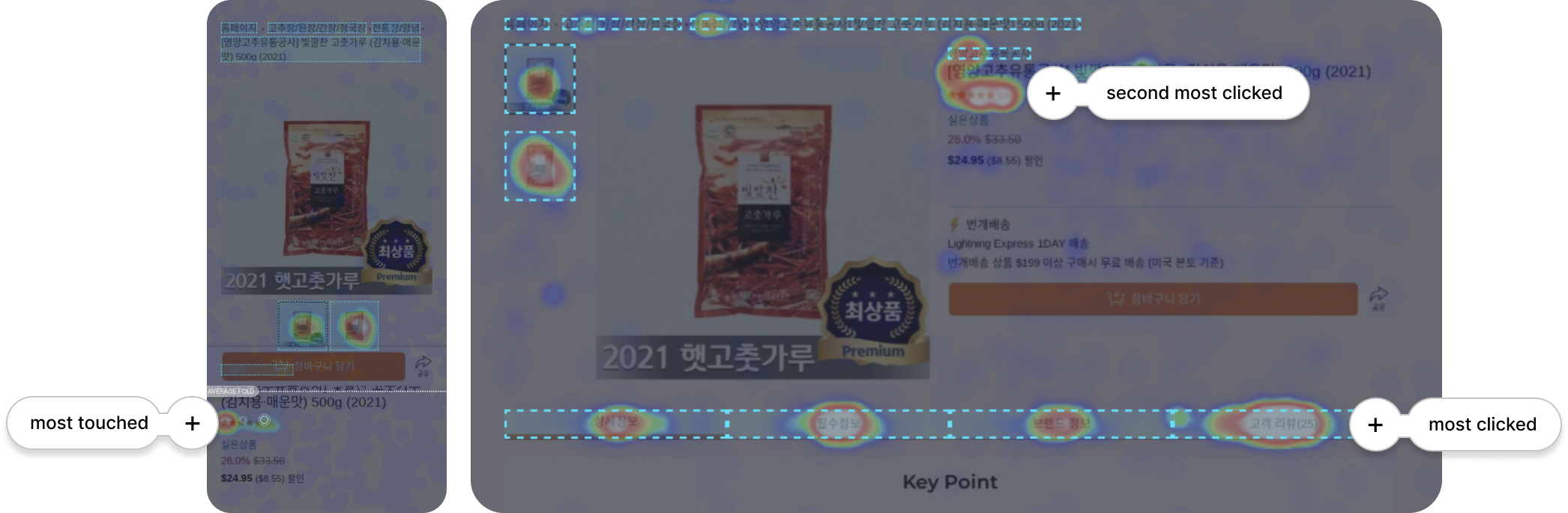
A heatmap showing users prioritize reviews over product details.
Approach
This project was done over three months in a squad of 1 project manager and 3 engineers. The process included ✧ diving into the problem space, ✧ design exploration, ✧ final design/implementation, and ✧ measuring performance.
Diving into the problem space
We began by analyzing user datas to confirm the findings from our survey, and found out that only 7.3% of customers leave a review. To dig deeper, we conducted usability tests with real customers and a competitive analysis of U.S. and South Korean platforms. This helped identify key issues in both usability and credibility.
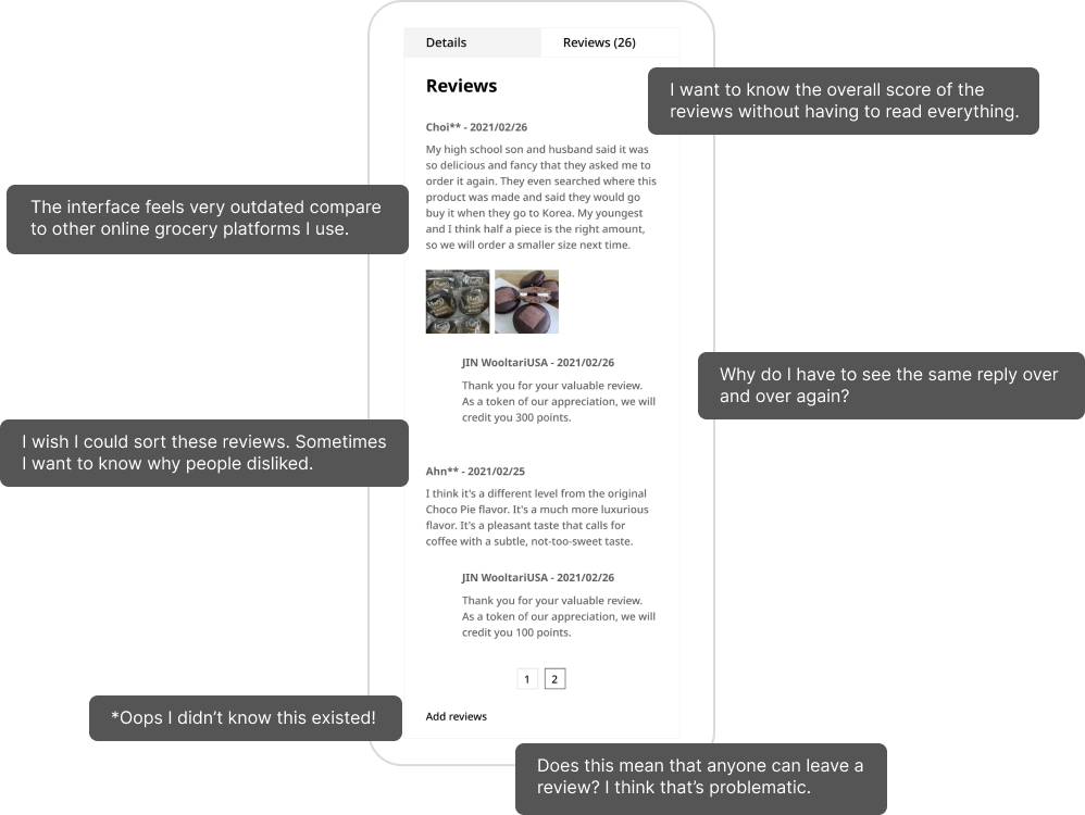
Valuable insights gathered from user testing on the previous interface and system (as-is).
Based on these insights, we set four primary design goals:
Seamless Post-Purchase Integration
The review process should naturally fit into the customer's journey.
Quick Access to Insights
Reviews should provide concise, valuable information at a glance, without redundancy.
Verified Credibility
Only verified customers should be able to leave reviews, ensuring authenticity.
Enhanced Usability and Aesthetics
Leaving reviews should be easy and intuitive, as well as visually pleasing.
Design Exploration
The focus was on two key areas: improving the review section for prospective customers and streamlining the review submission process for verified users within their purchase journey. The design process included multiple iterations, A/B testing, and user feedback, with project managers and engineers closely involved to ensure feasibility and smooth implementation.
Redesigning the Review Section
We started with quick UI improvements (①), guided by research insights and ensuring consistency with the design system and brand identity. Then, we added a summary of key review insights at the top of the section (②). After exploring and narrowing down to two potential design directions, we conducted A/B testing, with Option A emerging as the preferred choice for providing clearer, at-a-glance insights.
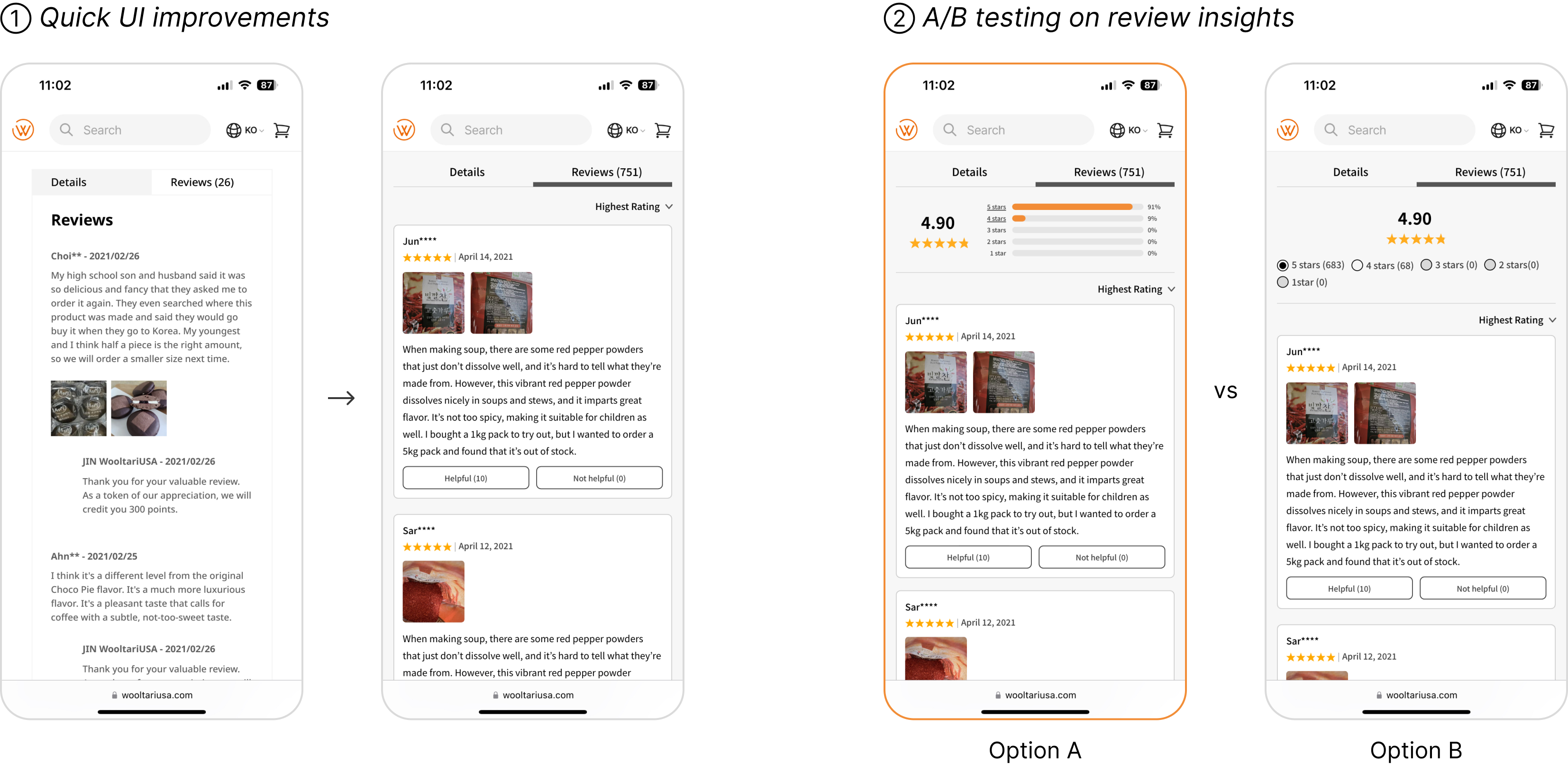
Another key insight from A/B testing revealed that users preferred photo reviews over text-only ones. In response, we added a dedicated section for users who prefer browsing reviews with a photo-first approach.
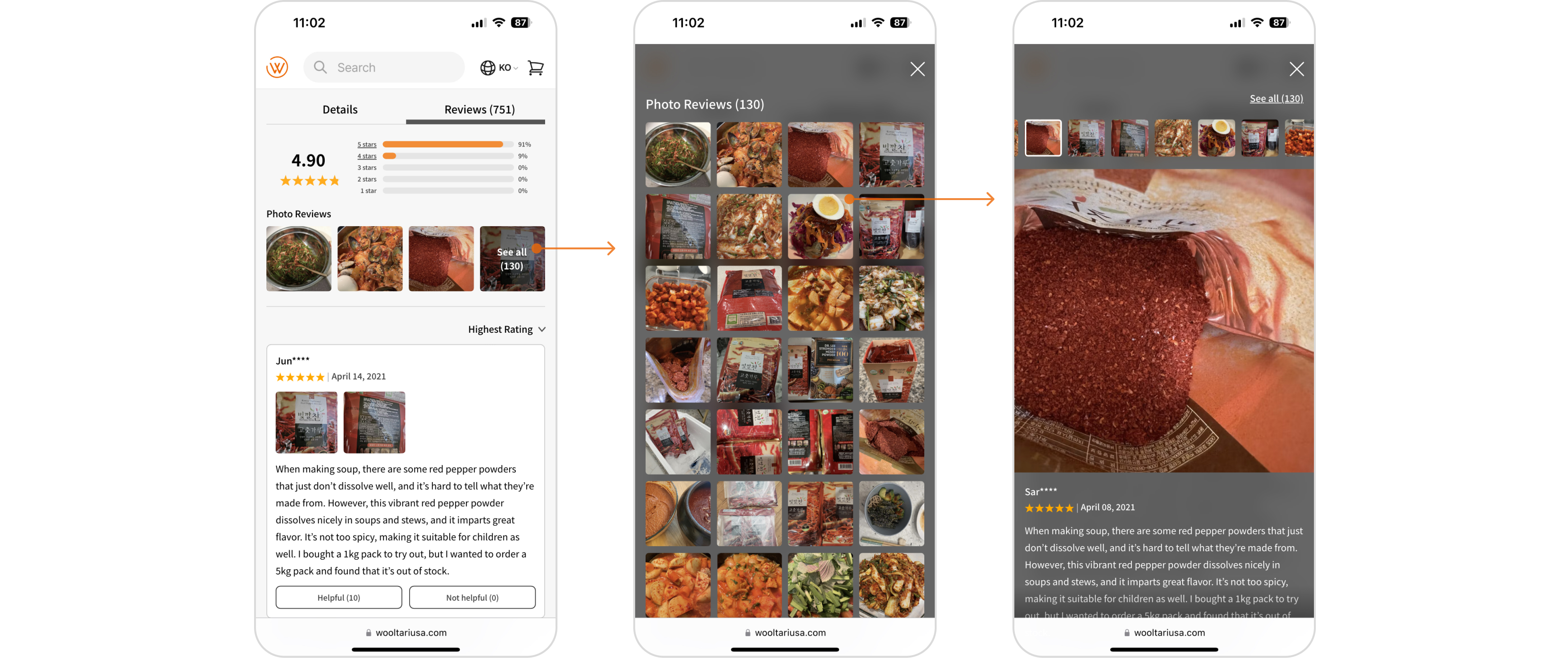
Iteration including a dedicated section for photo reviews
Streamlining the Review Submission Process within the Purchase Journey
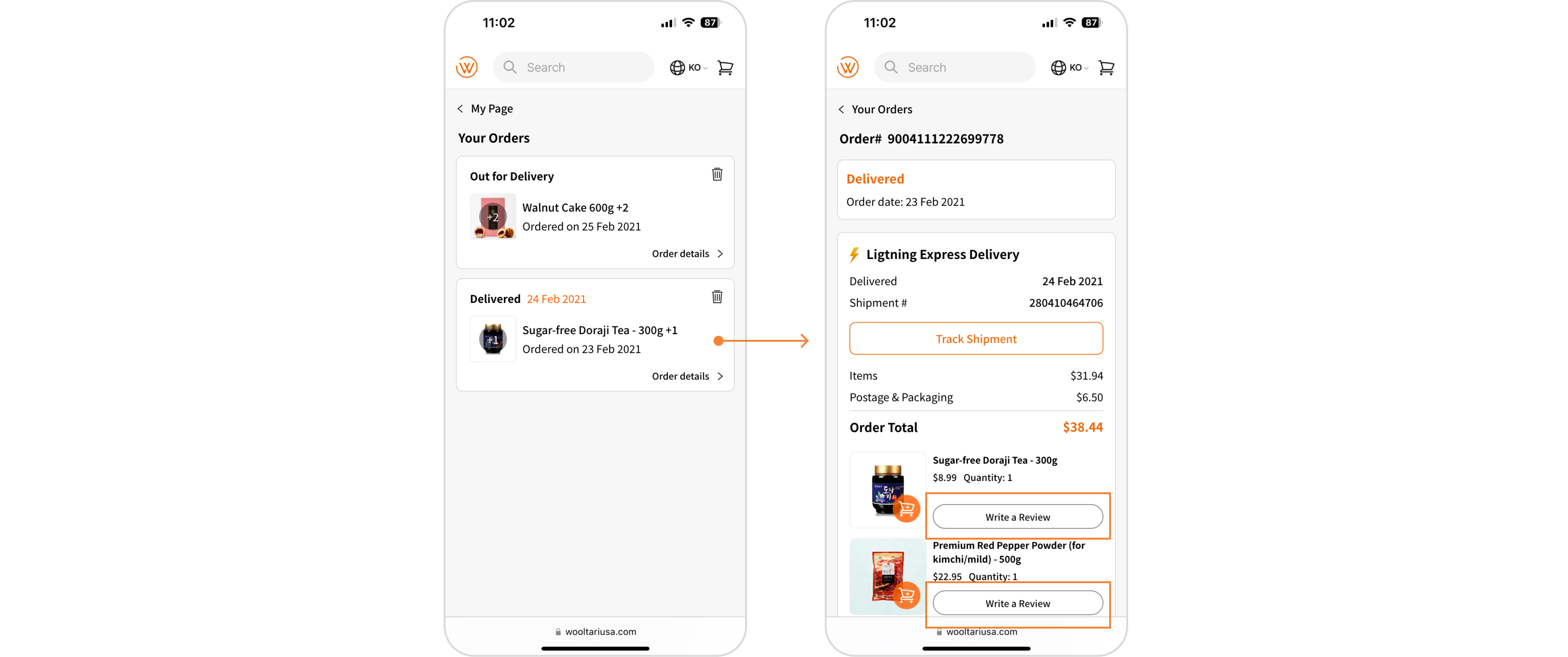
To ensure only verified customers could leave reviews, we designed a simple review submission flow, accessible directly from order history and removed ‘Add Review’ CTA from the product review section.
Initial design
In the initial design, the "Write a Review" CTA was located within the order details, requiring users to navigate through multiple layers to leave a review.
① 1st iteration and a flow
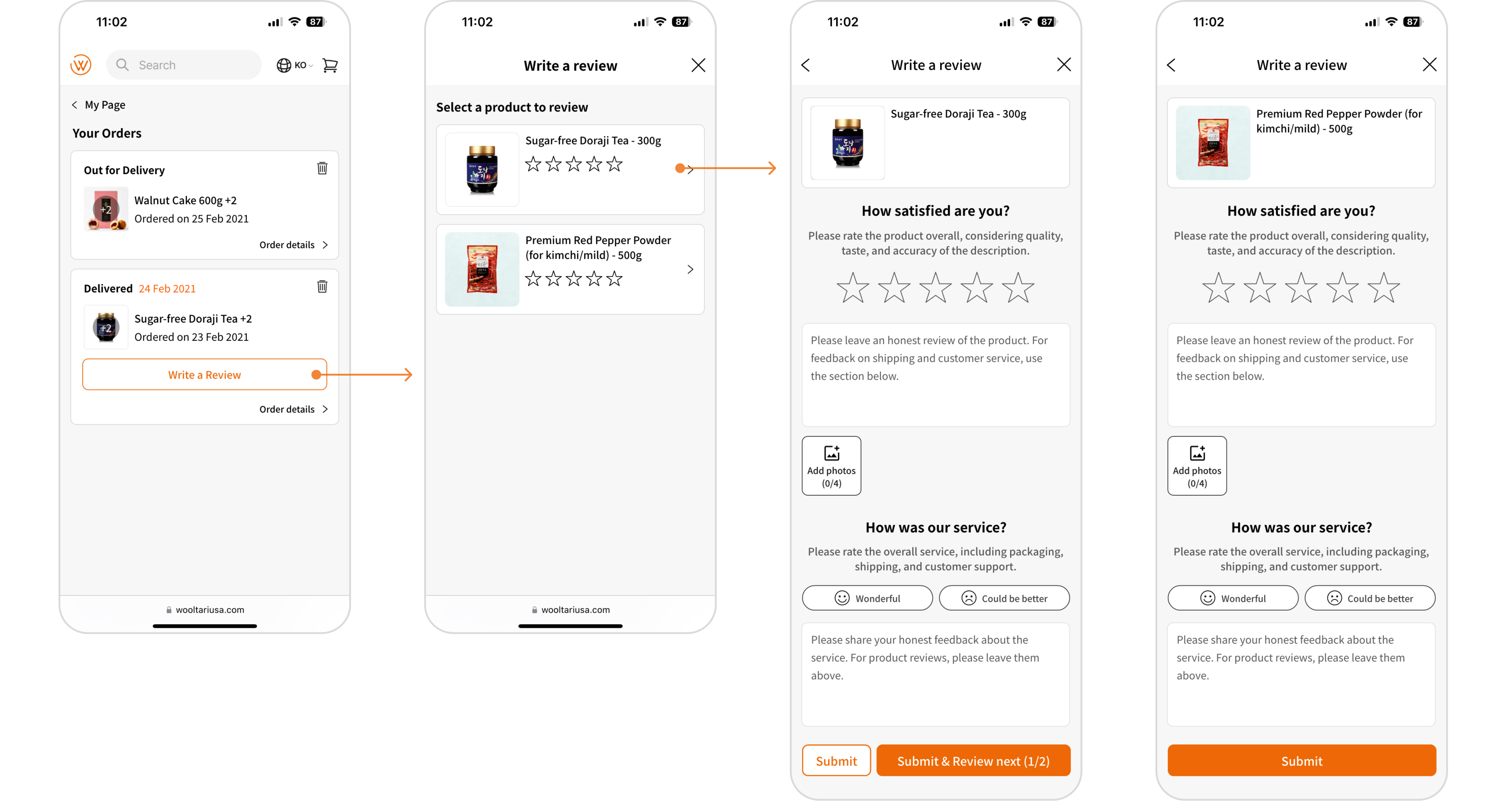
We relocated the CTA to the order list for easier access, enabling users to write a review directly from the list without needing to go through each order’s details (①). This adjustment makes it easier for users to write a review quickly or be prompted to do so while they look for their orders.
② 2nd interation based on user testing insights
Testing ① with users revealed that combining product reviews with service feedback was confusing and redundant. Consequently, we separated the service review into its own section, simplifying product-specific feedback (②). Additionally, we replaced the old, redundant individual replies with a clear prompt message to show appreciation for leaving a review.
Measuring Performance
To evaluate the impact of the new review design, we analyzed key user metrics and collected feedback via a survey module. The results highlighted the design’s effectiveness in the following areas:
Increased Engagement on Leaving Reviews

13.7% more customers left reviews for three months after the new design, compared to three months before. The percentage of customers leaving review increased from 7.3% to 21%.
High Credbility on Reviews
87% of users found the new design to add credibility on reviews, attributing this to the restriction of reviews to verified purchasers and the ability to sort reviews by rating.
Enhanced User Satisfaction
93.5% of users were satisfied with the review process, frequently highlighting its ease of use and modern design. Additionally, 83.7% were satisfied the review section, especially the summarized insights with star ratings and the dedicated photo review area.